The Best Peach & Coral Paint Colors
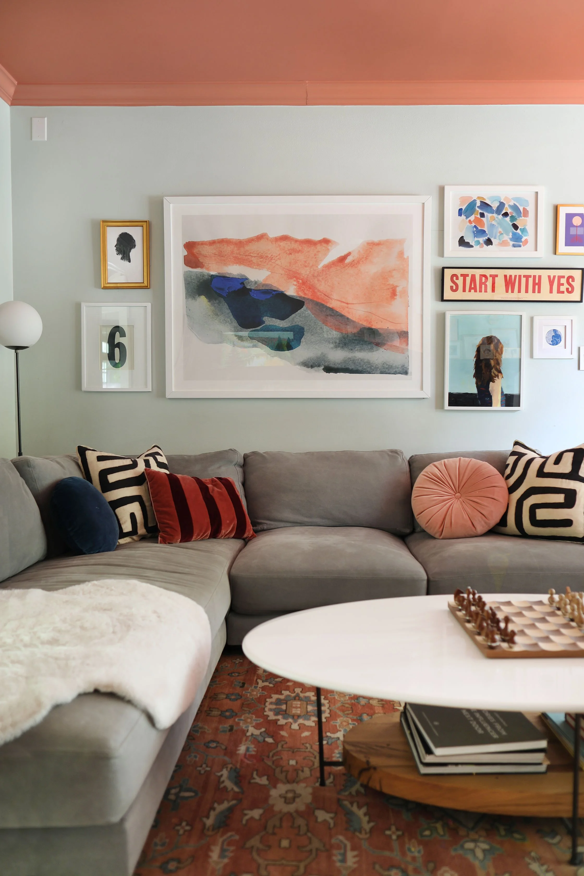
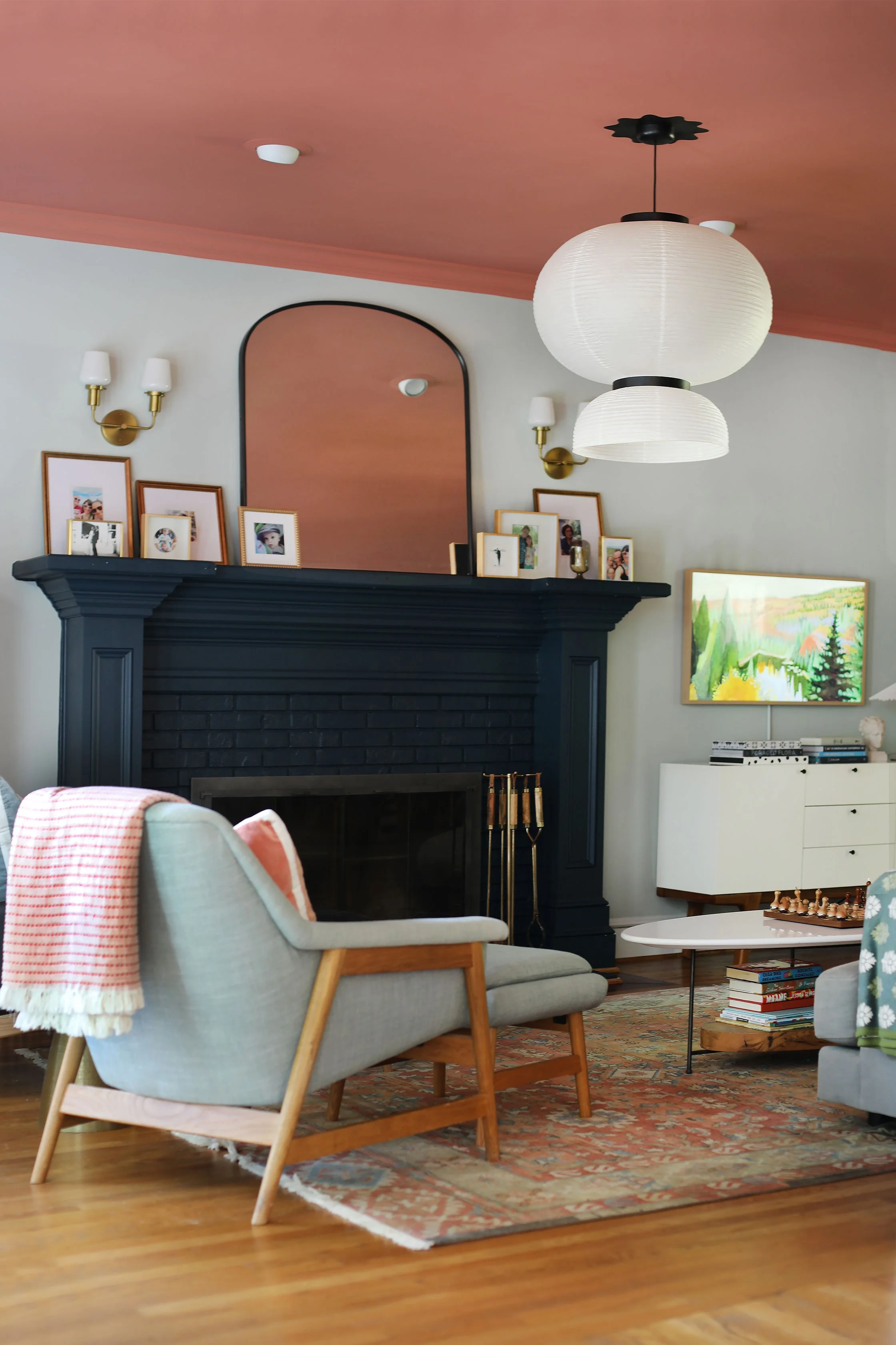
There’s something about a soft peach wall (or ceiling) that just feels good.
It’s warm without being heavy.
Colorful without being overwhelming.
And when done right, it brings a quiet kind of personality into a space.
Peach and coral tones are having a moment again—but this time, they feel softer, more grounded, and much more livable than what we’ve seen in the past.
The key is choosing shades that lean earthy and muted, rather than overly pink or bright.
Why We Love Peach & Coral
These tones have a way of completely shifting the mood of a space.
They:
Add warmth without making a room feel dark
Reflect natural light beautifully
Pair effortlessly with neutrals, woods, and layered textures
Create a home that feels welcoming and lived-in
We especially love them in bedrooms, living spaces, and powder rooms—anywhere you want a soft, elevated warmth.
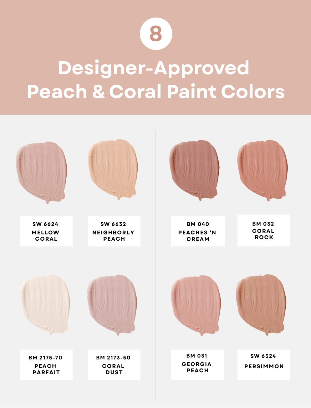
Our Favorite Peach & Coral Paint Colors
These are the tones we come back to again and again—because they feel timeless, not trendy.
Soft + Subtle (Barely-There Warmth)
SW Mellow Coral (6624)
A soft, creamy coral that adds warmth without reading too colorful.
BM Peach Parfait (2175-70)
Light, airy, and almost neutral—perfect if you’re just dipping into color.
True Peach (Balanced + Fresh)
SW Neighborly Peach (6632)
A classic peach tone that feels warm and welcoming without being overly sweet.
BM Georgia Peach (031)
Slightly deeper, with a natural warmth that works beautifully in lived-in spaces.
Warm Coral (Where It Gets Interesting)
BM Peaches ‘n Cream (040)
A soft, creamy coral that brings a subtle glow to a room.
BM Coral Dust (2173-50)
Muted and slightly dusty—this is coral done in a more refined, grounded way.
Deeper Coral (Rich + Earthy)
BM Coral Rock (032)
A warm, earthy coral with depth—great for adding character without feeling bold.
SW Persimmon (6324)
A richer, terracotta-leaning coral that creates a cozy, layered look.
A Few Things to Keep in Mind
Not all peach tones are created equal.
When selecting a color, look for shades that:
Feel slightly muted or softened
Lean more orange or clay than pink
Work with your home’s natural light
And always test samples—these tones can shift beautifully throughout the day.
Need Help Choosing the Right One?
This is exactly the kind of decision we help guide during our color consultations—bringing clarity, confidence, and a cohesive direction to your space.