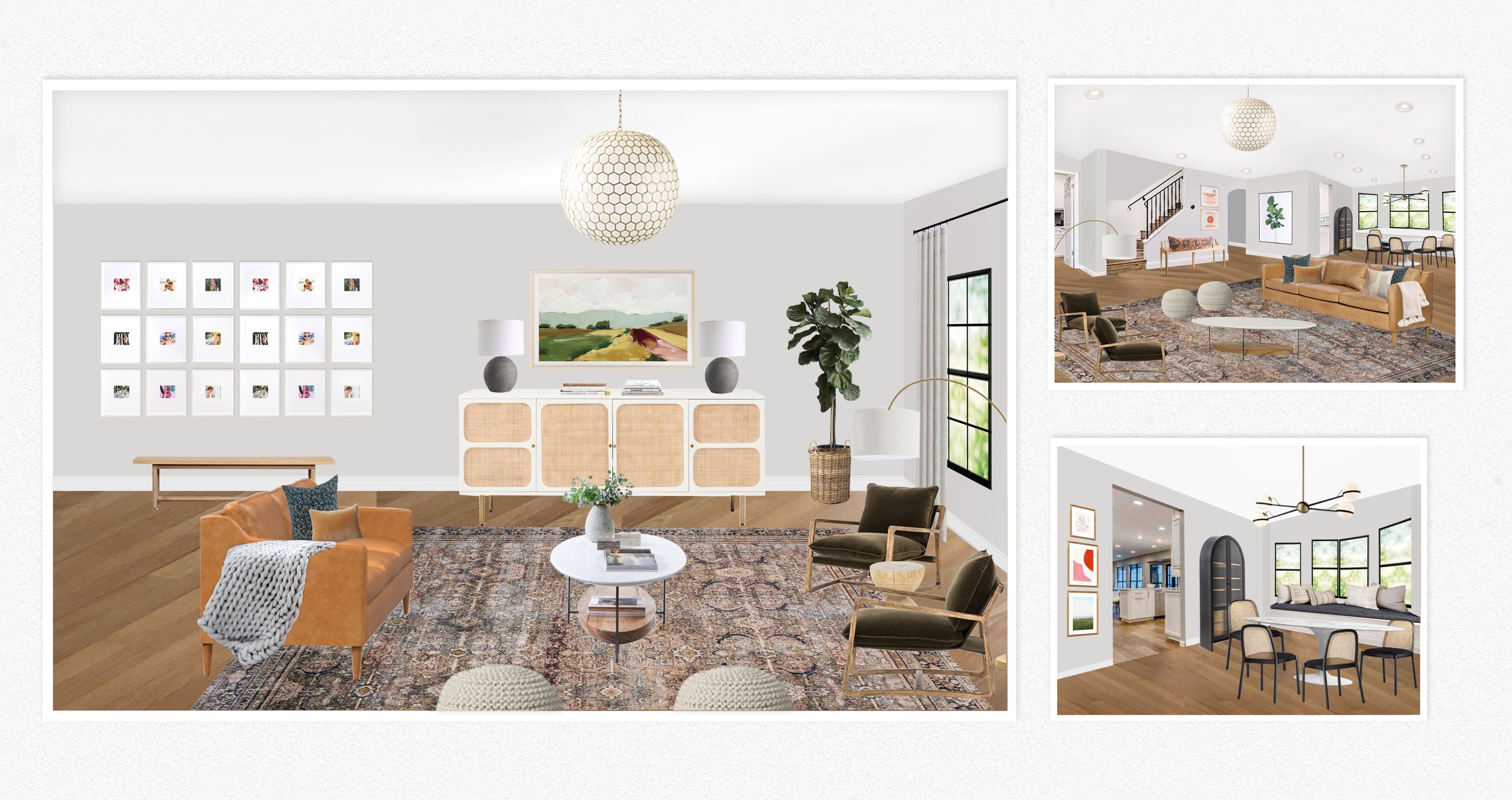
Sunny Circle Studio Wallpaper Has Arrived!
/Our very own line of wall coverings?
Check!....One Tulips, that is.
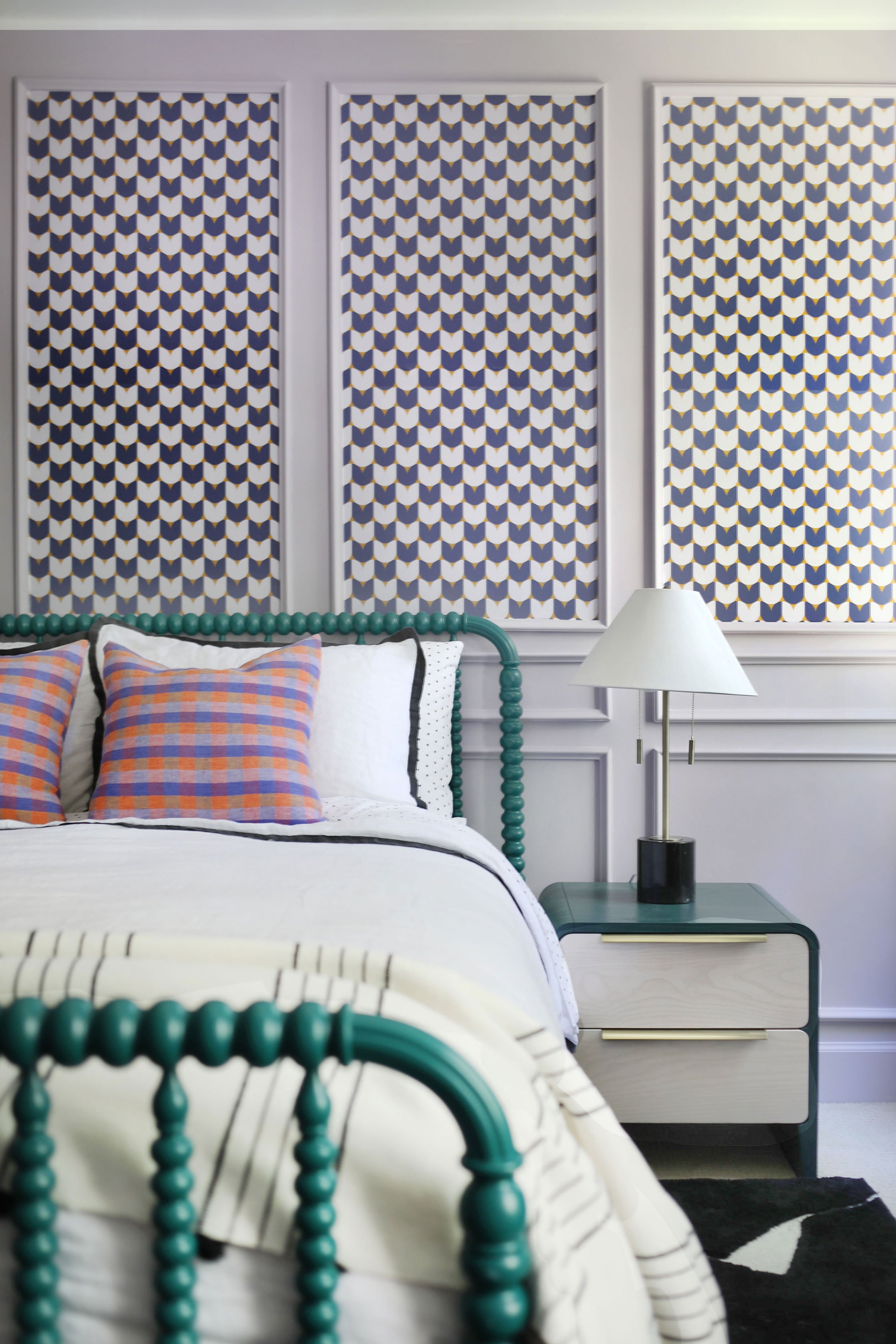
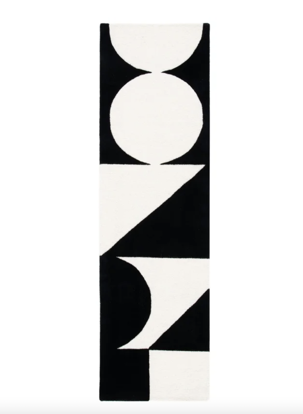
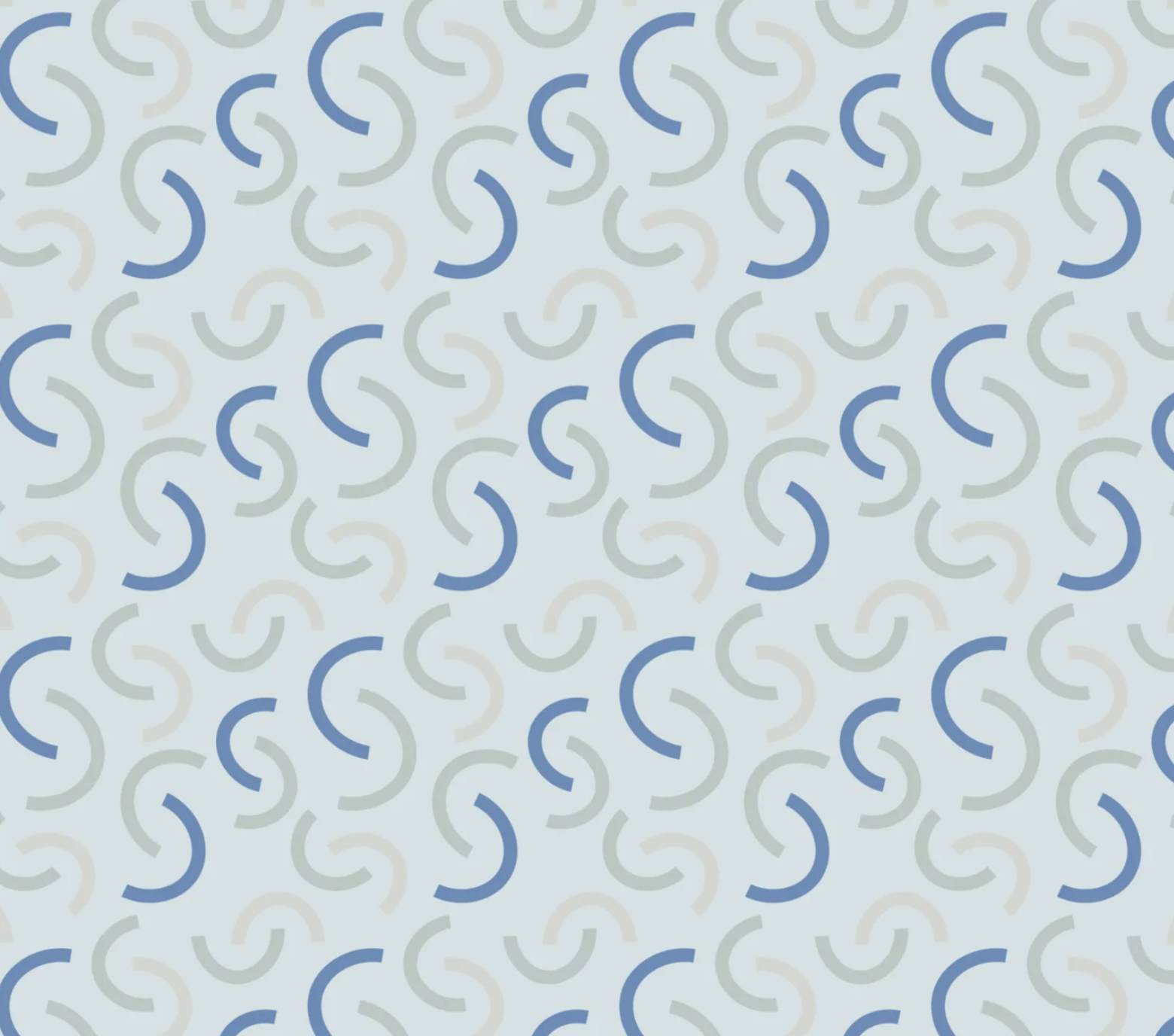
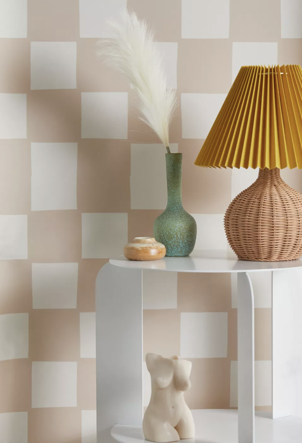
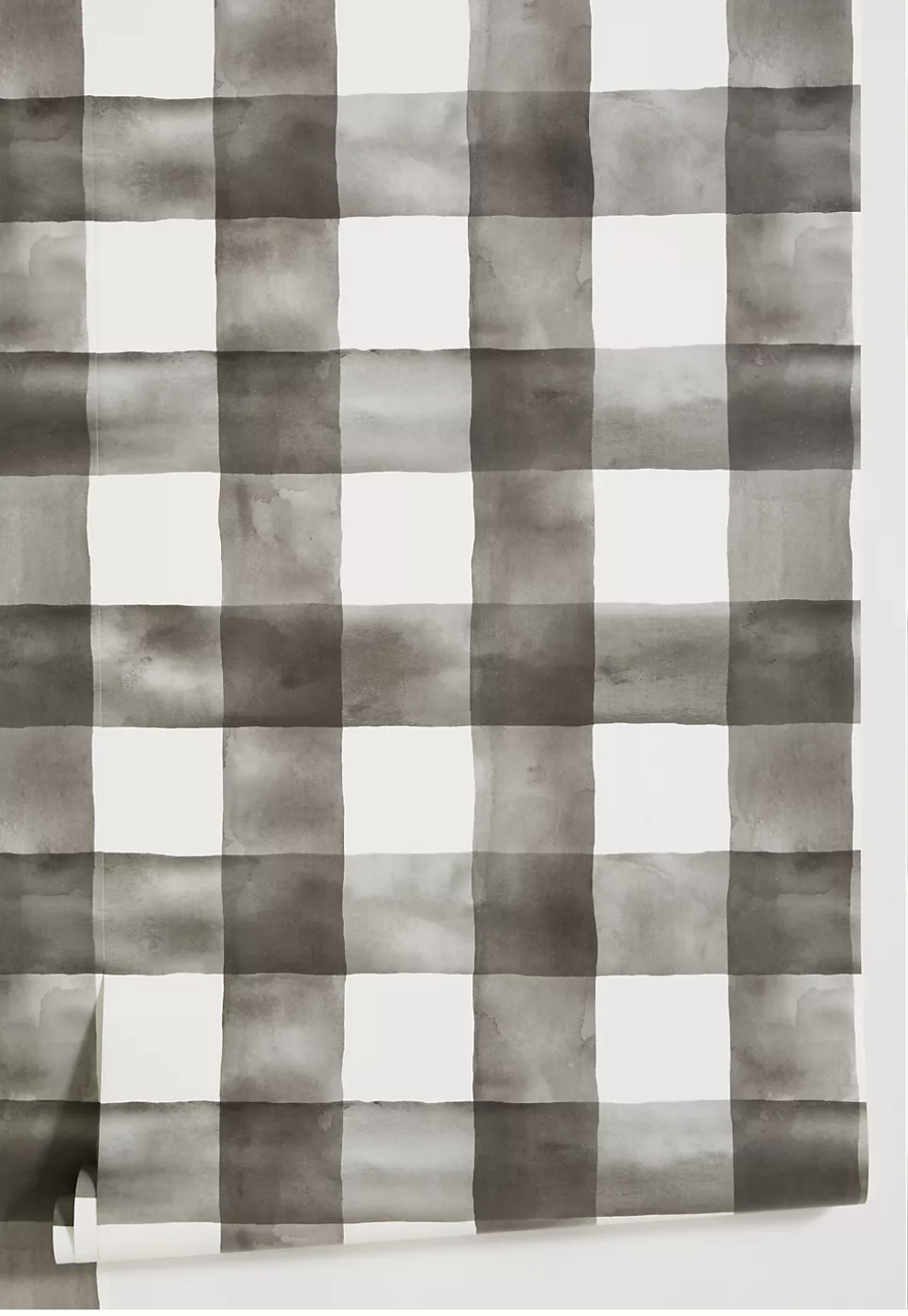
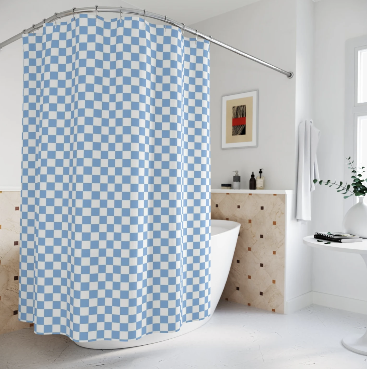
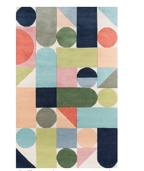
‘CHECK ONE TULIPS’ WALLPAPER IN ‘STATELY’

That’s the name of this super cute peel-and-stick wallpaper. It’s just one of the bold, new designs from Sunny Circle’s collection of wall coverings with
Urban Walls.
And we’re so excited to share it with you!

‘BIRDS OF A FEATHER’ WALLPAPER IN ‘ELEGANT’
Since we are Sunny Circle Studio, we found inspiration in our name—deciding to base every design off of what can be made from a circle…half circle or quarter circle.
It's been really fun to literally start from scratch and create our own collection of wall coverings that can hopefully inspire more interior Sunny-Circle vibes for folks who don’t get to work with us directly.
Our goal was to create a variety of wallpaper, murals and decals that played with color, shape and scale in simple but interesting ways that still felt cohesive.

‘Tulip kisses’ in ‘elegant’
Each design—ranging in subject from flowers and waves to birds and suns—comes in three colorways: Bright (which is more youthful), Elegant (which leans more classic) and Stately (which is a bit more dramatic). The collection brings Scandi-vibes and mid-century modern feels, with lots of bold geometric prints juxtaposed with the softness of rounded edges.
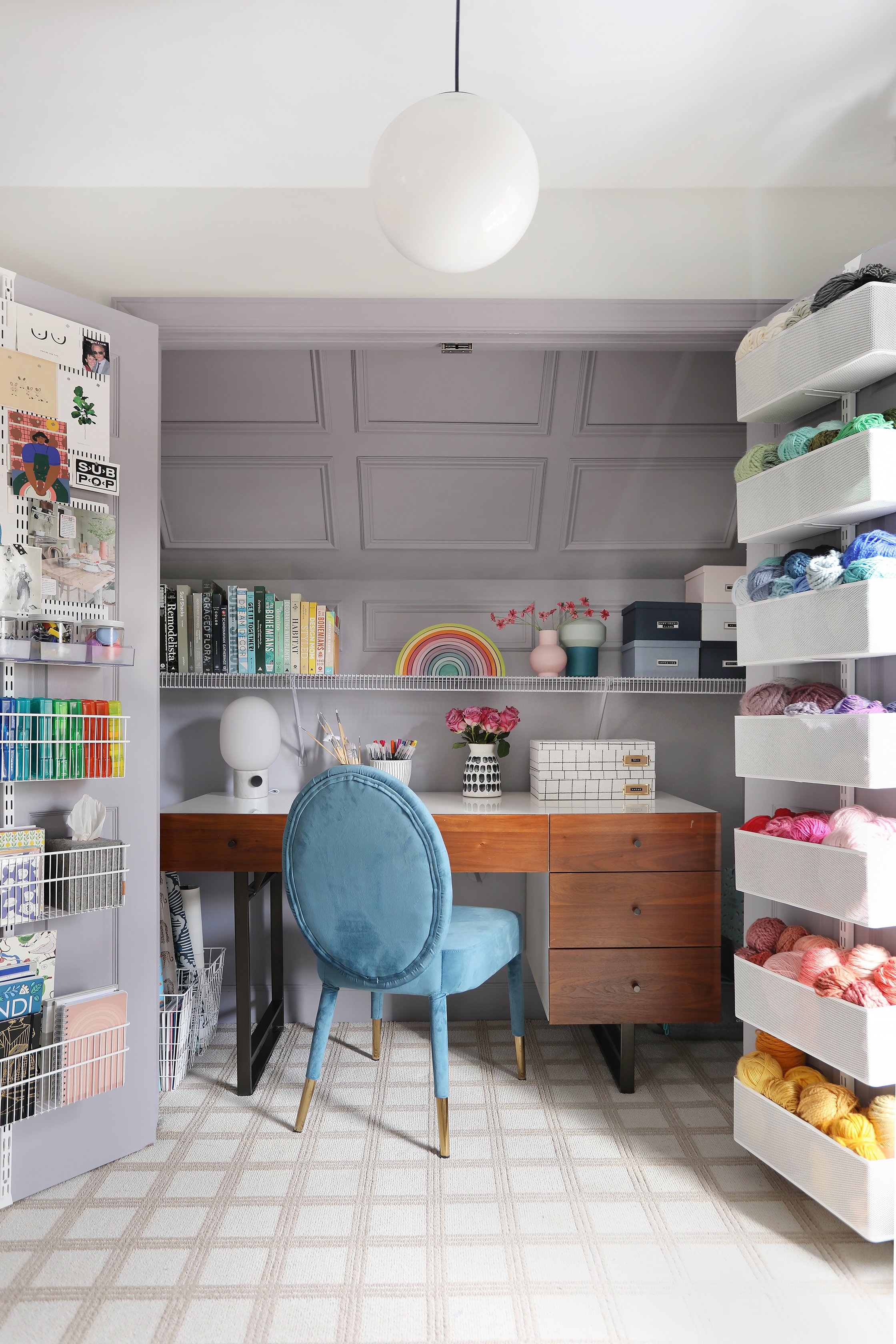
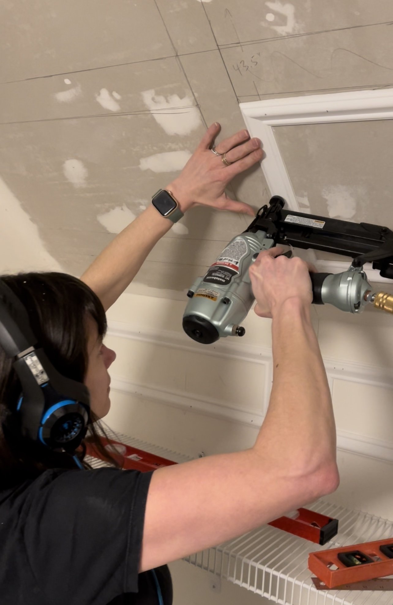
One of the best parts about wallpaper is the fact that there are so many ways to use it—especially peel-and-stick. Sure, you can go full-room…and we do! But sometimes you just want to have some fun with an accent wall.
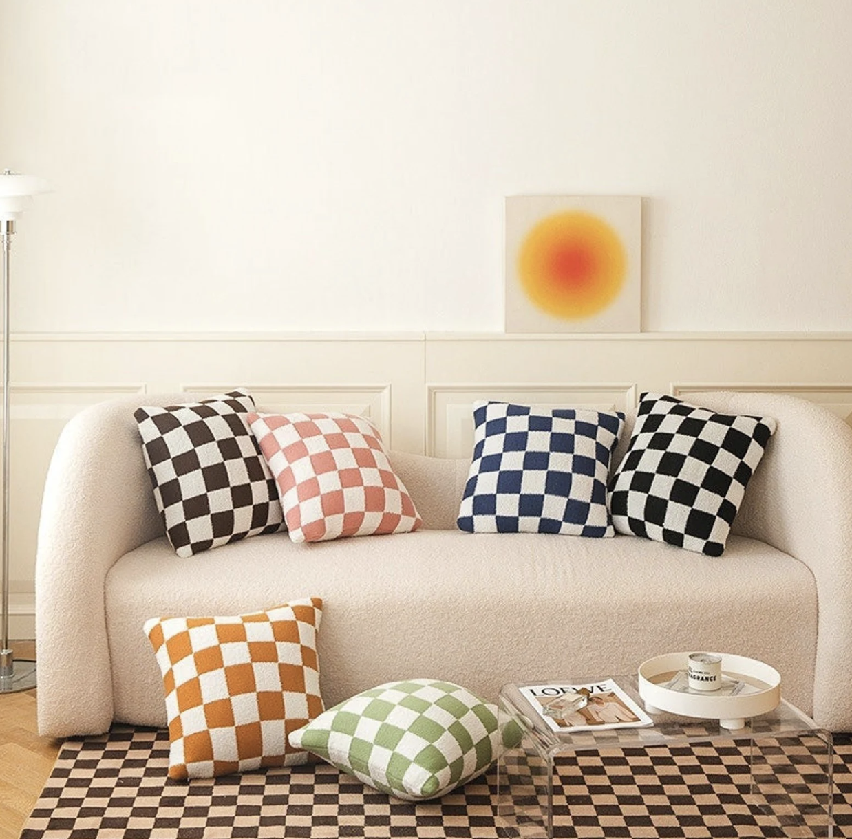
“Our 'Pack a Punch' decals give you the freedom to design & create your own unique vibe”

‘PACK A PUNCH’ DECALS IN B&W


‘CHECK ONE TULIPS’ WALLPAPER IN ‘STATELY’

‘BIRDS OF A FEATHER’ WALLPAPER IN ‘ELEGANT’

Or maybe you want to add a surprise pop of print to a closet, pantry, some drawers, doors, or stairs…basically, this collection is ideal for anywhere you want to add some personality. And since it’s peel-and-stick, you can keep it for a long time or change it up whenever the mood strikes.

‘WAVE HELLO’ WALLPAPER IN ‘STATELY’

‘Tulip kisses’ in ‘elegant’
Check out the rest of our collection—and fill your cart—at Urban Walls. Hope you enjoy this line of wall coverings as much as we did making it!
xo, Erin & Amy